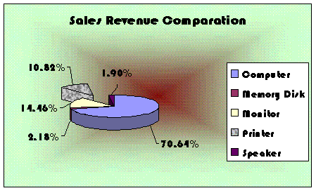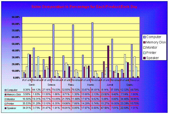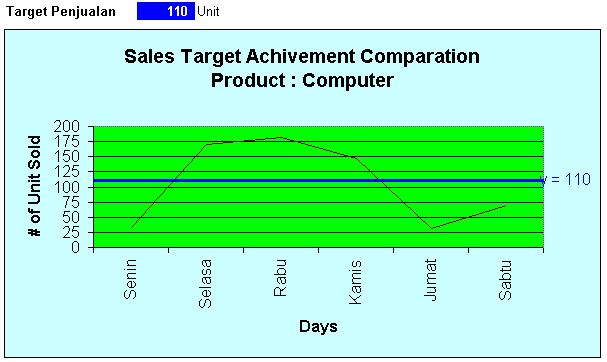
ProblemsetQualification Round Sunday, 5 August 2007 Topic : SpreadSheet - Graph Manipulation Please download content in : DataGrafik.xls Part 1 - In This part, you have to create 3 graphs, all using the data that have been download. - Fill in field "Product Name" and "Prices" using lookup function from the table in the right side - Fill in field "Total Revenue" using simple calculation between "# of unit sold" times "Prices" - Save all your answer (3 graphs) in one file, separate it in three different sheet. Name the files with "graph.xls". - In Creating all the graph, you are free to manipulate the data using certain method, but suggested you are using Pivot Table. Part 2 : Create Graph 1 just like the sample below. - Pie Graph Created - All font using Bauhaus 93, For title 14pt and other 11 pt - The graph represented the total calculation of total revenue, in percentage format. - The Printer pie, is separated from the other pie, and the color is change into granite texture - The background color is using two color from centre, Light green and Dark Red - Provide with a line (graph line), between the pie and the label Sample view of Grafik 1  Part 3 : Create Graph 2 just like the sample below. - Bar graph created - background color is using two color from corner, Blue and light turquoise - Fill color for graph background is yellow. - All font using Arial, Title 11.5pt, legend 10 pt, others 8. For % at the left bar is bold. - the data in the graph represent the comparation in percentage between five products each day in unit and in rupiah. So the total # of unit in percentage if we calculated in 'Senin' will be 100%. The result will be exactly like the sample, if the graph data is correct. - The left percentage scale is growing from 0%, stacking each 10% until 90% - The bottom data for days is stated in Bahasa, for the owner is from Indonesia. Make it sequence from "Senin" to "Sabtu"s - Add with the data in the bottom area, and equipped with red border. Sample view of Grafik 2  Part 4 : Create Graph 3 just like the sample below. - Line Graph created - Background color is Light Turquoise and bright green - Font is Arial 14.5 and Arial 12 - # of unit data scale, start from 0 until 200, and stacking every 25. - Above the graph there is certain cell that could be change the data for the target - There is a target line in the graph, and all with some note in the end about the number - If the target number in the cell changed, the target line in the graph is also moving according to the new target. Sample view of Grafik 3  |
| Copyright © 2007 Bina Nusantara University - All rights reserved |  |
| Term of Use | Privacy Policy | |